Planning to Paint: How to Pick Your Perfect Shade
In the first blog our Painting Series, we take a look at selecting your perfect palette. We know that choosing the paint colours for your home can be a daunting task, but with the right guidance, it can also be an enjoyable and rewarding experience. Whether you're embarking on a full-scale home renovation or simply refreshing a room, selecting the ideal paint is essential for achieving your desired ambience and atmosphere. In this guide, we'll explore everything you need to know about selecting paint colours; from considering natural lighting and understanding paint undertones to incorporating complementary colours and reflecting the function of your space.
Key Colour Considerations:
Mood: It is well known that colours affect our mood, and psychologists believe that certain shades can determine our emotional response to a space. Soft colours like blues and greens can create a calm and relaxing atmosphere, while bold and vibrant colours like reds and yellows can energise and invigorate. Consider how you want to feel in your space, and then refine your colour selection to reflect this.
Room Size: Traditionally, we were advised to avoid dark colours in smaller spaces, however, designers today are far more inclined to use colour to evoke a sense of either spaciousness or cosiness. Dark colours are now utilised to create a sense of vastness in intimate rooms, while light colours that previously were thought to evoke that spaciousness, can leave a space feeling less cosy. By considering both room size and mood, you can narrow down your paint choices.
Existing Elements: Take into account existing furniture, flooring, and other elements in the room. Ensure that your paint colour complements these items rather than clash with them, ensuring everything feels complementary and coordinated. As Sarah Lloyd from Valspar tells us: ‘It’s much easier to buy a tin of paint than it is to buy a new sofa. So, before you choose a paint scheme, buy all the furniture you love and then base your colour choices around them’.
Room Purpose: It's important to take the time to consider how you use your space. Think about the function of the room – is it a cosy living room for relaxation, a busy family kitchen, or a bedroom retreat? Understanding your space and its intended purpose will guide your paint colour choices.
As you explore the principles of painting, it's important to keep in mind that there are often exceptions to every rule. If you decide to break away from convention and showcase your own unique style and creativity, it should be embraced and celebrated!

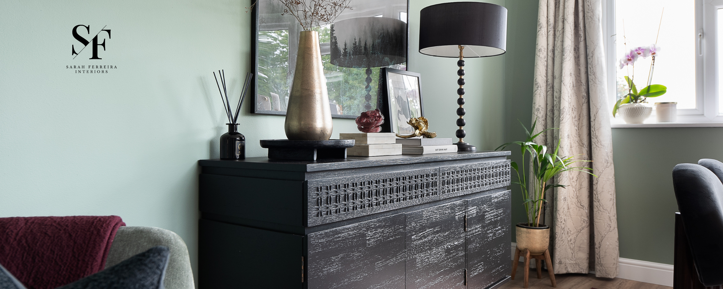
Image by Farrow & Ball
Colour Wheel and Palettes:
Look for colour inspiration within your own home, design magazines, Pinterest, or even in nature. Aim to create a colour palette that includes the main wall colour, accent colours, and trim colours for a cohesive look.
Familiarise yourself with the colour wheel to understand the relationships between different colours. Complementary colours (opposite each other on the wheel) can create a dynamic look, while analogous colours (next to each other) offer a harmonious palette.
Don't stress about keeping up with paint trends. If you truly love a specific trending colour, go for it. It's all about making a choice you won't second-guess down the line. Trends come and go, so just do what feels right for you.

Image by Lick.com
Harnessing Natural Lighting:
One of the most important factors to consider when selecting paint colours is the natural lighting in your home. Sunlight can vastly affect paint colours, depending on the warmth or coolness of the light, time of day and even time of year. The same colour will look different in a south-facing room versus a north-facing room, so it is important to consider your room orientation when selecting your paint.
Rooms that receive ample natural light may benefit from cooler tones to balance the warmth, while rooms with limited natural light may feel brighter and more inviting with warmer hues. Before making a decision, observe how natural light interacts with your space throughout the day to ensure that your chosen paint colours look their best in all lighting conditions.
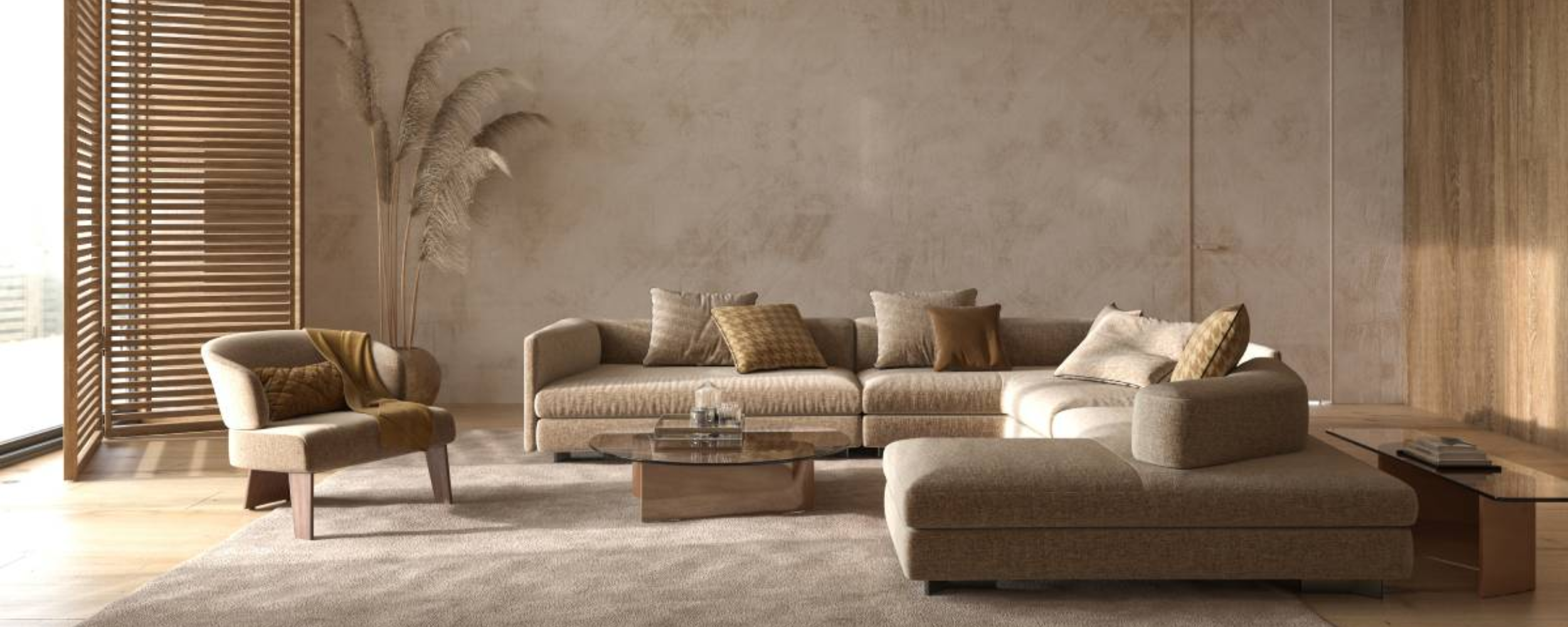
Image by V1ctoria for Shutterstock
Below is a quick guide to painting for your room orientation:
North Facing Rooms
North facing rooms receive cooler, indirect sunlight throughout the day, often with blue undertones, creating a softer illumination. To balance the cool light, opt for warmer tones like creams, warm reds/browns, and warm beige to add a cosy ambience, without appearing stark. Opt for light shades with warm undertones (such as off-white, beige and taupe) to brighten the space by bouncing light and adding dimension.
South Facing Rooms
Bathed in bright, direct sunlight for most of the day, south facing rooms boast vibrant and lively colours due to the intensity and warmth of sunlight. Flora Hogg at Craig and Rose advises that south facing rooms ‘can bring out yellow base tones. So, choose something cooler than you might normally go for – the sun will warm it up. Blues, greys and greens are perfect choices for south-facing rooms’.
When selecting paint for east and west facing rooms, it is important to consider the time of day that you are most frequently using the space. The natural light in your space changes dramatically from dawn to dusk, changing the appearance of your chosen colour throughout the day.
East Facing Rooms
Benefiting from softer and warmer morning sunlight, east facing rooms gradually brighten throughout the day with a warm tint. Consider light, soft shades like pale yellows, soft greens, and light blues to complement the morning glow and enhance natural light.
West Facing Rooms
Afternoon and evening sunlight casts warm, golden tones in west facing rooms, intensifying warm colours. Embrace warm hues such as reds, oranges, and earthy tones to harmonise with the natural warmth, creating a welcoming and comfortable ambience. Flora Hogg urges us to ‘make the most of that precious golden hour at sunset by enhancing it with warm-based neutrals or sage greens.’

Deciphering Paint Undertones:
Undertones subtly influence a room's ambiance, playing a crucial role in creating a cohesive and visually appealing palette.
Let’s take a common neutral paint colour, like beige. If you mix light brown with tomato red, you get a colour like pale hot chocolate. Mix the same light brown with yellow, and you get tan. Or with green, and you get khaki.
This secret colour presence can make or break a room. If you choose beige with a hot, red undertone, but your fixed elements (cabinets, countertops, and tiles) have a cool, blue undertone, you may find your space lacks a cohesive look.
Dominant vs Undertone Colours
Identifying undertones can be as simple as distinguishing the dominant colour, known as the mass tone or overtone, from the hidden undertone. It's like blending blue with a black tint for indigo or adding a green tint to blue for a vibrant turquoise. The colour you perceive is the dominant one, while the unseen colour is the undertone.
The Power of Undertones
Warm Undertones: Infuse a space with a cosy feel through shades of yellow, red, or orange.
Cool Undertones: Create a refreshing and calming vibe with tones of blue, green, or purple.
Neutral Undertones: Offer a versatile backdrop for various colour schemes, ensuring balance and adaptability.
Uncovering Undertones
You can figure out the undertone by comparing your paint to a true colour – one with no undertones. The colours with no undertones are pure white and the true primary colours are red, yellow and blue.
Compare to White: Hold paint swatches against pure white surfaces to highlight and distinguish the undertones more vividly.
Consider Surroundings: Place your paint sample in its intended space and observe how nearby objects or furnishings influence the appearance of the paint colour, bringing out subtle undertones.
Consult Paint Cards: Many paint cards from UK brands conveniently label paints with indicators of their undertones, such as 'brown,' 'blue,' or 'red.' These labels provide valuable clues about the undertone type.
Observe in Natural Light: Examine paint swatches in both natural daylight and shadow to understand how undertones may vary in different lighting conditions.
By understanding undertones and considering their impact on your space, you not only enhance your colour palette but also add a personal touch. It's like discovering the hidden stories within the colours that bring your space to life.

Image by COAT Paints
Incorporating Complementary Colours:
While choosing a single paint colour is a fantastic starting place, incorporating complementary colours can add depth and visual interest to your space, giving you more opportunity to show personality. Keep it simple by picking two opposite colours from the colour wheel to create a complementary colour scheme. This scheme thrives on contrast, drawing attention and injecting vibrancy into your space. Here's the trick: designate one colour as your main base, and sprinkle in its complementary counterpart as accents. If a colour feels a tad too bold, tone it down by introducing a hint of its complement.

Selecting the perfect paint colour for your home is a multifaceted process that requires careful consideration and thoughtful planning. By understanding your space, harnessing natural lighting, deciphering paint undertones, and incorporating complementary colours, you can confidently choose paint colours that transform your home into a space that reflects your personality and style.
In the next blog in this Painting Series, we’ll explore tips and tricks for painting and using sample pots.
If you are unsure of how to select the perfect paint for your space, our Interior Designer by the hour service offers the perfect opportunity to receive expert advice and guidance. We’d love to hear from you, please contact us today.
Happy painting!